Sunday, July 17, 2011

DLG


http://tahoe.usgs.gov/DLG.html

This is an example of a DLG. A DLG or Digital Line Graph is a digital representation of the features displayed on a U.S. Geological Survey topographic map.  DLGs contain a wide variety of information depicting geographic features. Example: hypsography, hydrography, boundaries, roads, utility lines, etc
The map above is a DLG of Lake Tahoe

Saturday, July 16, 2011

Statistical Map


http://mappery.com/map-of/United-States-Travel-Time-to-Work-Statistical-Map

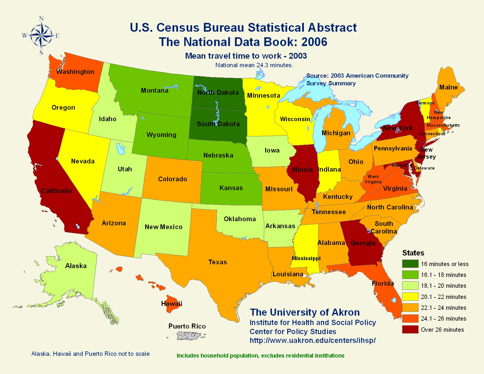
This is a statistical map of the average "travel time to work" per state. The average time for the country as a whole is 24.3 minutes. The key on the right is in equal intervals of 2 minutes which means that the map is not skewed in any way. It's just pure data.

PLSS map

http://www.fairview-industries.com/standardmodule/mn-exmpl.htm


The Public Land Survey System (PLSS) is a way of subdividing and describing land in the United States. The map above shows a town in Minnesota subdivided. Each one of the smaller sized squares is 1/16 of a section. The Bureau of Land Management designed this map so there would be an increase in the clarity of communication when dealing with cadastral matters, between cooperating organizations.

LIDAR Map

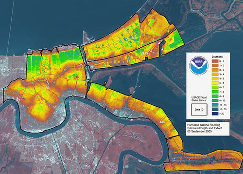
This is a LIDAR map of flood areas in New Orleans, LA after Hurricane Katrina. LIDAR is an optical remote sensing technology that can measure the distance to, or other properties of a target by illuminating the target with light.

Star Plot

http://www.itl.nist.gov/div898/handbook/eda/section3/starplot.htm

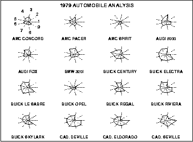
The plot above contains the star plots for 16 cars. The variable list for this star plot is as follows:
    1Price
    2Mileage (MPG)
    31978 Repair Record (1 = Worst, 5 = Best)
    41977 Repair Record (1 = Worst, 5 = Best)
    5Headroom
    6Rear Seat Room
    7Trunk Space
    8Weight
    9Length
We can use this information to compare cars to each other, or to find a specific trait we want for our car whether it's price or gas mileage.

Correlation Matrix

http://yin.che.wisc.edu/images.htm

A correlation matrix is very similar to a similarity matrix, except that a correlation matrix shows the correlation between all pairs of data sets. The picture above shows a correlation matrix that was calculated for a protein for phage T7 (dealing with genetics).

Similarity Matrix


http://cgi.mtc.sri.com/Cluster-Lab/
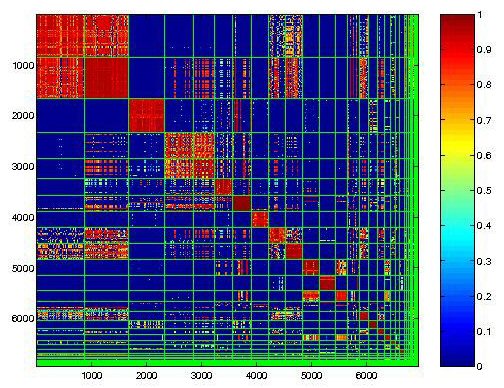
This is a Behavioral Clustering Similarity Matrix. A red pixel means the similarity are close to 1 or 1.  A blue pixel means there are small similarity to none

Stem and Leaf Plot

http://mainland.cctt.org/mathsummer/JosephBond/StemAndPlots/stem-and-leaf_std.htm


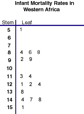
This is a stem and leaf plot. The number in the "stem" is in the "ten's place," and the leaf, is all the data numbers that fall within that stem. Looking at the plot above... the stem 12 has associated "leaf's:" 1,2, and 4. This is just a simple way of saying 121, 122, and 124.

Box Plot

http://edubuzz.org/blogs/nbhs3x1/2007/01/08/8-jan-2007-five-figure-summary-and-box-plots/


A box plot provides a simple graphical summary of a set of data. It shows a measure of central location (the median), the average (the mean), and measures of dispersion (the mode). On the box plot above, the median is 77.5

Histogram

http://academic.udayton.edu/gregelvers/psy216/spss/graphs.htm

A histogram displays tabulated frequency. This histogram is the result of a small study which asked the number of siblings for each participant. Out of 50 participants, the average number of siblings is 1.26.

Parallel Coordinate Plot

http://www.perceptualedge.com/articles/b-eye/parallel_coordinates.pdf

This is a parallel coordinate graph. In the parallel coordinate plot, each variable is graphed on a vertical axis. The counties with the highest percentages of college graduates have been highlighted. As you can see college grads tend to have a longer life expectancy as well as a higher income, compared to those without college degrees.

Triangular Plot

http://www.dplot.com/triangle-plot.htm

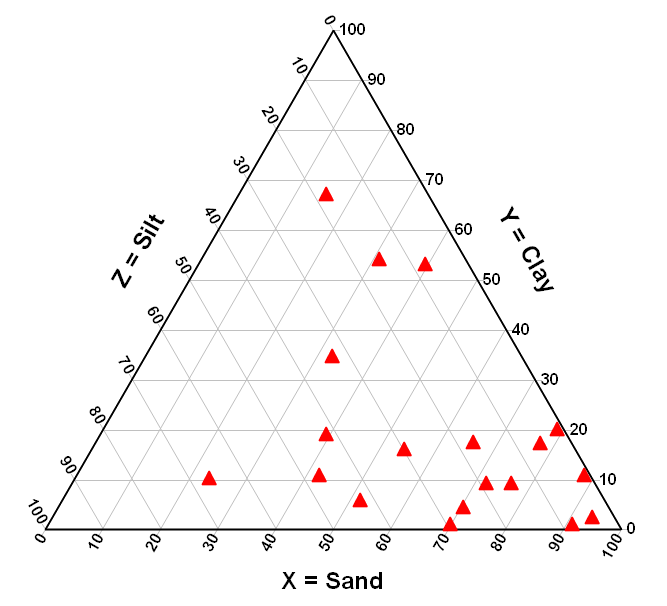
A triangle plot is a graph that uses 3 variables. It is usually used in geologic studies to show the relative compositions of soils and rocks. The sides of the soil texture triangle are scaled for the percentages of sand, silt, and clay

Windrose

http://www.raws.dri.edu/cgi-bin/rawMAIN.pl?laFMER

This is a windrose graph from Merritt Island, FL. This graph shows the frequencies of different wind directions and speeds throughout the month of June 2011. According to this, majority of the winds are from the East, which makes sense when you look at where Merritt Island is located. 

Climograph

http://www.uwsp.edu/geo/faculty/ritter/glossary/A_D/climograph.html


This is a climograph for Memphis TN. A climograph is a graphical depiction of the monthly precipitation and temperature conditions for a selected place. Precipitation is shown by the bar graph. A line graph depicts temperature.

Population Profile

http://dotearth.blogs.nytimes.com/tag/somalia/

Above, you will see two population profiles for Somalia. One is from 1975 and the other 2005 but the plots look like not much has changed. Children under the age of 20 make up a large amount of the population.


(NOTE: Vertical axis of the graphs, each bar is an age group spanning five years, from youngest at the bottom to oldest)

Scatterplot

http://mste.illinois.edu/courses/ci330ms/youtsey/scatterinfo.html

This is an example of a scatterplot. Multiple data is plotted on a graph and based on the results we can tell what type of relationship there is between the data. While there is no specific data being given, it is worth noting that this scatter plot has a positive relationship.

Index Value Plot

http://www.skepticalscience.com/What-causes-short-term-changes-in-ocean-heat.html


The Index Value Plot shows either a positive or negative value as compared to the index value which in this case is zero. In the example above, the index value is at zero and you can see how La Nina and El Nino compare to this index value. 

Lorenz Curve

http://www.personal.psu.edu/~dxl31/econ2/Spring_2006/lecture37.html


The black line shows how the data should be graphed given it is equally distributed. The purple line (the Lorenz curve) represents the actual distribution.  The further the Lorenz curve bows away from the line of income equality, the more unequal the distribution of income.

Bilateral Graph

http://www.treasury.gov/press-center/press-releases/Pages/js3033.aspx

This is a bilateral graph which illustrates the strong job growth and falling unemployment rate since the (former) President's economic policies have come into effect. 

Nominal Area Choropleth Map

http://timesonline.typepad.com/comment/2007/07/the-map-of-fait.html

This is a nominal area choropleth map of the 2004 Bush-Kerry election. This map shows who won which state (Bush-red, Kerry-blue) and how many electoral votes each was awarded.

Unstandardized Choropleth Map

http://commons.wikimedia.org/wiki/File:2004US_election_map.jpg

This is an unstandardized choropleth map of the 2004 election results. The reason why it is considered unstandardized is because the data is projected using raw data and it is not broken down into equal sections. Look at the key on the bottom left where is says "margin of victory." Bush has 5 different shades of red that could be colored-in and different data sets, while Kerry only has 3 color shades and different data sets.

Standardized Choropleth Map


This is a standardized choropleth map. These types of maps are great to use because they make sure that the data is presented in the most efficient and accurate matter. The map above looks at populations of people 14 and under within Canada.


Univariate Map

http://www.geog.le.ac.uk/russianheartland/DemographicMaps/Raions.html

Univariate choropleth maps are useful in showing data for a single variable. This could be the percentage of population per sq. mile, or amount of people that hold PhD's. It does not show multiple variables data. This map shows population density in Russia in 2002.

Bivariate Map

http://www.geog.le.ac.uk/russianheartland/DemographicMaps/Raions.html

A bivariate choropleth map is a map that displays two variables by using two different sets of colors and symbols in order to show a relationship between the two variables. This map shows the population density in 2002 and the percentage changed between 1989 and 2002. 

Classed Choropleth Map

http://timesonline.typepad.com/comment/2007/07/the-map-of-fait.html


This is a classed choropleth map. Here, areal units are combined into a smaller number of groups and portrayed in intervals. There are four intervals in this map explaining religious adherence.  

Friday, July 15, 2011

Unclassed Choropleth map

http://www.esri.com/news/arcuser/1003/files/choropleth.pdf

This is an unclassed choropleth map of divorce rates in the U.S. during the year 1990. See key at bottom left, it does not clearly define what color goes with which number. Hence it is an unclassed choropleth map.

Continuously variable Proportional Circle Map

http://www.lib.utexas.edu/maps/italy.html


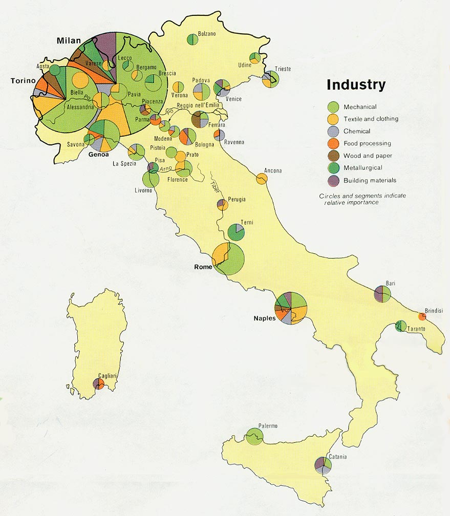
This continuously variable proportional circle map which shows where the major industries are located in Italy. This type of map uses circles convey data.

Thursday, July 14, 2011

Range Graded Proportional Circle Map

http://pubs.usgs.gov/fs/fs-004-03/

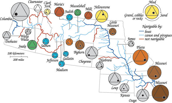
This is an example of a range graded proportional circle map. The map is based off of findings by Lewis and Clark and show the different color, width, and type of bed material for many of the rivers and streams in the US. The color of the large circle approximates the color of the water (gray indicates no color was mentioned in the journals). Descriptions of the bed material are determined by the position of the solid black circle within the black triangle.

DOQQ

http://www.geology.enr.state.nc.us/doqq.html

Digital orthophoto quarter quads (DOQQ), are computer generated images of an aerial picture that has been removed of any large displacements. This type of imagery is unique because it is a combination of characteristics of a photograph and geometrics of a map. Unlike an uncorrected aerial photo, an orthophoto can be used to measure true distances, because it is an accurate representation of the Earth's surface. 

DEM Map

http://oe.oregonexplorer.info/craterlake/dlgv32.html

This is a Digital Elevation Model of Crater Lake National Park. DEM's are digital models or 3-D representations of a terrain's surface The lower elevations are darker colors and the higher elevations are lighter colors. 

DRG Map

http://www.topozone.com/map.asp?lat=43.7411111111111&lon=-110.801666666667


A digital rastor graphic (DRG) map is just a topographic map that has been scanned onto the computer. Above is a DRG of the Grand Tetons.

Isopleth Map

http://www.stonelions.com/Conoco.htm

This is an isopleth map of the Conoco refinery in Lake Charles, LA. The cartographer is mapping the sulfer-dioxide(SO2) emissions flow from this refinery, which produces about 5 tons of pollution every hour.

Wednesday, July 13, 2011

Isopach Map


http://www.kurdistan-geology.com/print.php?type=N&item_id=33

This is an isopach map of Iraq. Isopach maps are useful in determining the thickness of a stratum. Many oil companies use isopach maps to find suitable drilling locations.

Isohyet Map

http://www.countyofsb.org/pwd/pwwater.aspx?id=3772#Middle

Isohyet maps are maps drawn with contour lines that measure rainfall. Isohyet maps are similar to isobar maps and isotach maps. The map above also has colors to help display the different levels of rainfall in the area for those who can't read a contour map.
http://www.intellicast.com/National/Wind/Current.aspx?region=tlh

This is and Isotach map. It is different from an isobar map, because isobar only measures pressure while isotach measures wind speed. Each line on the map shows a constant wind speed.

Isobar


Here is an isobar map. The isobars are lines drawn on the map by joining places of equal average atmospheric pressure. In the map above, each line has a pressure difference of (+/-)4 mb.

Doppler Radar

http://data.strandvision.com/animated_weather_radar.html

This is a map with the weather in Minneapolis, MN. The colors indicate stronger or weaker weather. The doppler radar picks up weather phenomena by emitting microwaves in direction and listening to the reflection coming back. You can see towards the upper right of the map, the weather stops in the shape of a circle. That's the limit of visibility for this specific radar.

Tuesday, July 12, 2011

Black and White Aerial Photo

http://eros.usgs.gov/#/Find_Data/Products_and_Data_Available/NAPP

Here is a black and white aerial photo of San Diego taken from 20,000' ASL

Infrared Aerial Photo

http://eros.usgs.gov/#/Find_Data/Products_and_Data_Available/NAPP


This is an infrared aerial photo of San Diego, CA. 
Green, healthy vegetation has a high reflection level of near-infrared wavelengths and appears red on the processed film. For example; the large red area near the bridge is actually a golf course and the large red square in the center is the San Diego Zoo and nearby parks.

Cartographic animation

http://cartography2.org/Chapters/page12/HistoryMapAnimation.html


This is a cartographic animation of population growth patterns in Detroit. While this is not like the animation of today, this was considered ahead of its time in 1970.

Cartogram

http://www-personal.umich.edu/~mejn/cartograms/

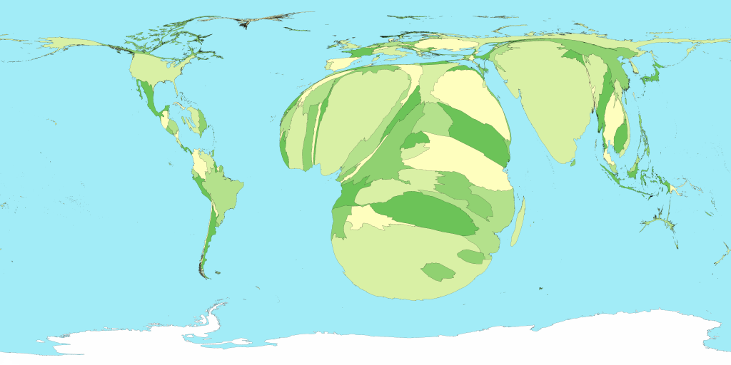
This a a cartogram map of people in the world living with HIV/AIDS. As you can see Africa distorted to be larger due to a larger number of HIV/AIDS cases.
http://hci.caece.net/hci-wiki/CoursePresentation2007/FlowMapLayout

This is a flow map showing the exporting of wine from France(center) and where they were shipped to in 1864.

Isoline Map

http://mapmaker.rutgers.edu/355/Journey_to_Work.jpg


This is an isoline map. Each line represents the amount of time needed to reach a point on any line from New York City in 1800.

Proportional Circle Map

http://www.neiu.edu/%7Eechalper%20/377/pinkcirclefincrop.jpg


This is a proportional circle map from 1990. This map shows the average prices for rental homes within each state. Higher rent means a larger circle.

Choropleth Maps


http://my.ilstu.edu/~jrcarter/Geo204/Choro/Tom/hispanic_race_fl-H1_FINAL.gif

This is a choropleth map of the percentage of people who are hispanic in each county as of the 2000 census.

Monday, July 11, 2011

Dot distrbution map

http://img.technospot.net/h1n1-swine-flu-google-maps.png


This is a Dot distribution map created on Google Maps of the H1N1 flu pandemic. The Purple marker is a confirmed case, the pink marker is a suspected case, the yellow marker is a negative case, and fatal cases have no dot

Propaganda Map

http://farm4.static.flickr.com/3281/2722416468_0030c1d7c3_o.jpg


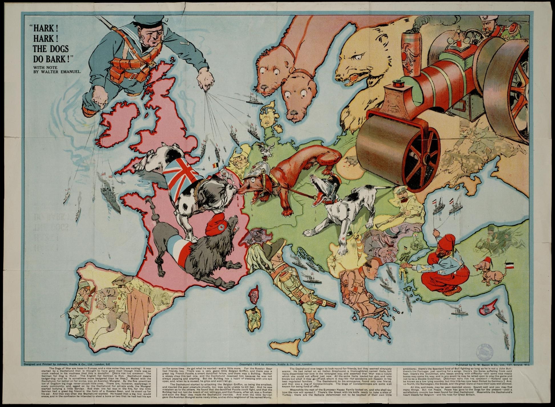
This is a propaganda map from World War 1. The cartographer uses dogs to symbolize nations at war and even gives an explanation in the small print at the bottom.

Hypsometric Map

http://upload.wikimedia.org/wikipedia/en/4/4f/India_topo.png


This is a Hypsometric map of India. Notice the correlation between color and altitude.

Cadastral Map


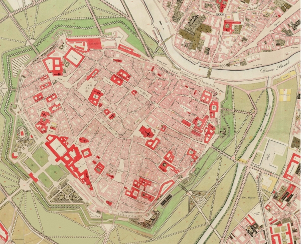
This is a Cadastral Map of Wien(Vienna), Austria. It shows individual buildings. The buildings in red have crosses on them, marking a church.

Tuesday, July 5, 2011

Thematic Map


http://www.mapsofworld.com/world-airroutes-map.htm#

Above is a thematic map for Delta Air Lines and their partners. The map shows the air routes which Delta flies on their international flights.